If you are someone who indulges in plotting useful visualizations for your dataset, you have come across this choice: Boxplot vs Violin plot? Data Visualization tools like Tableau, PowerBi, Qlik View, and Looker along with programming languages such as Python (Matplotlib, Seaborn) and R Programming (ggplot2) offer data analysts/scientists with these visuals but it comes down to the details when one wants to use either of them in their analysis.
In this article, we’ll go over what Boxplots and Violin plots are and some quick pointers to help you decide which one is better for your data: Boxplot vs Violin plot.
Also, read -> Bokeh vs Plotly: Which one is better in 2022?
Boxplot vs Violin Plot: Understanding both
what is a boxplot?
Boxplots or otherwise known as box-and-whisker plots show the distribution of quantitative data from a given dataset in a way that facilitates comparisons between variables or across the chosen categorical variable. The structure of the boxplot is such that the quartiles of the dataset i.e. Q1, Q2 (Median), and Q3 are shown with the Max and Min values of the dataset while the external points (or anomaly points) are shown outside the end whiskers that is a function of the inter-quartile range (anything below Q1 – 1.5*IQR or above Q3 + 1.5*IQR where the IQR is the Interquartile Range i.e Q3 – Q1).
Boxplots are useful in cases when you need to tell more than just count or frequency of things from your data. The median and quartile information along with the fact that outliers can be viewed before plotting a separate visualization like a scatterplot makes a boxplot as good as two to three visualizations put together.
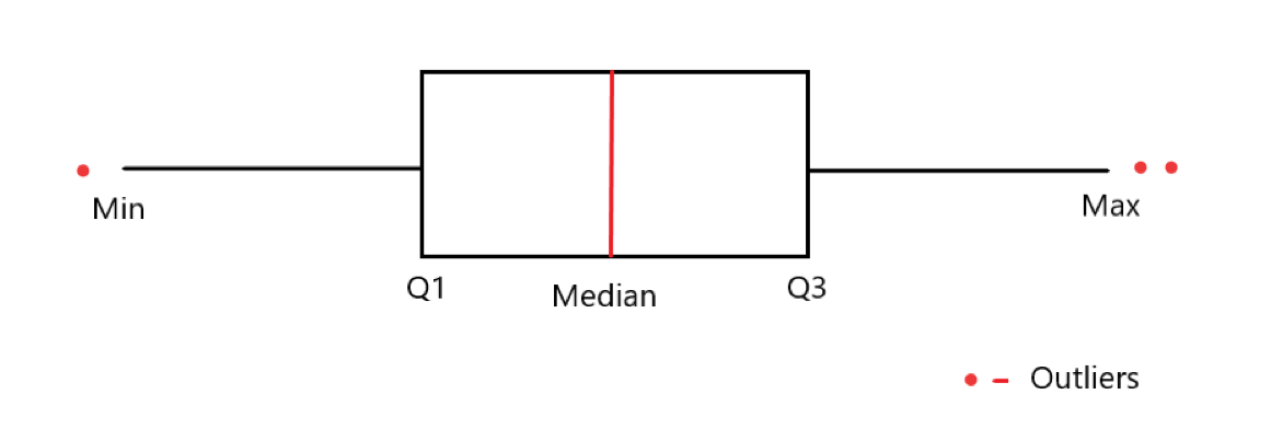
As you can see from the image above, the Boxplot is a very useful visual when compared to the typical Histogram or Barplot where so much information is not conveyed. A boxplot can be used for comparisons over different features too using differentiating components such as colors.
Let us look at an example of Boxplots prepared using the seaborn library in a Jupyter Notebook using Python 3:
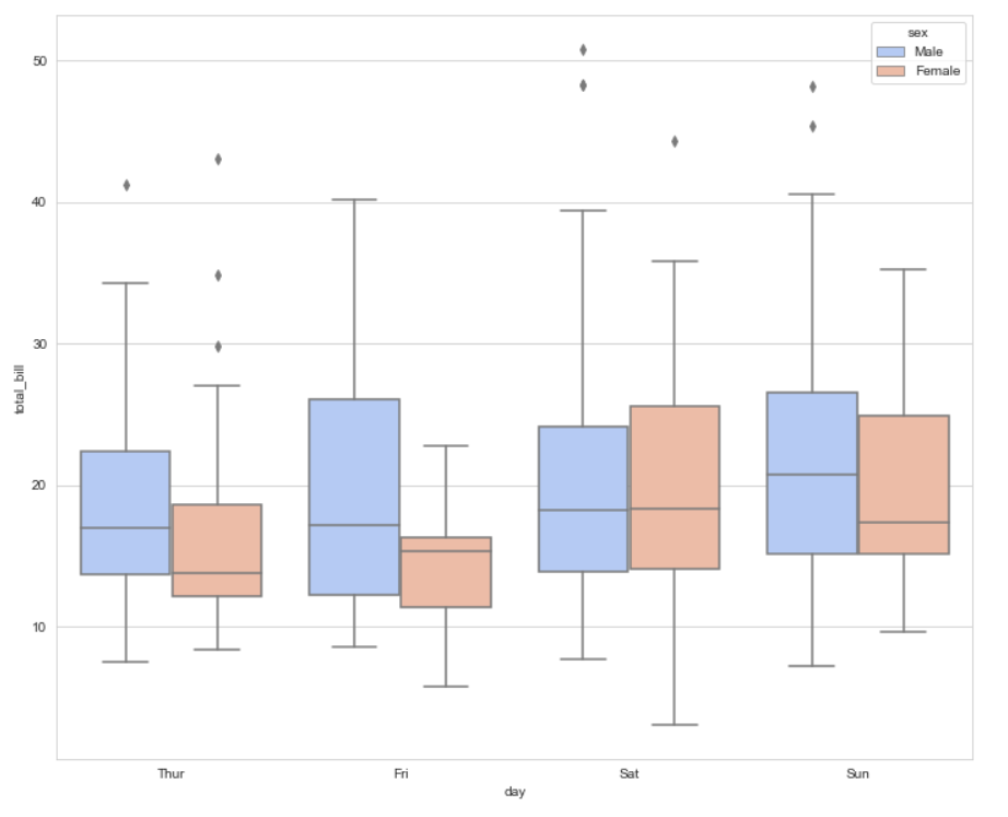
This boxplot shows the total bill amount received by a restaurant on multiple weekdays differentiated by a hue for gender. When choosing between Boxplot vs Violin plot, also check how similar the code is.
For more on Boxplots, read -> Boxplots
For the full code on how this boxplot was made, find it below:
import matplotlib.pyplot as plt
import seaborn as sns
%matplotlib inline

tips = sns.load_dataset('tips')

sns.boxplot(x='day',y='total_bill',data = tips,hue='sex',palette='coolwarm')
What is a Violin Plot?
Boxplots are informative and can help analysts analyze the data by just viewing it. But what when you need information a tad bit more than a Box plot?
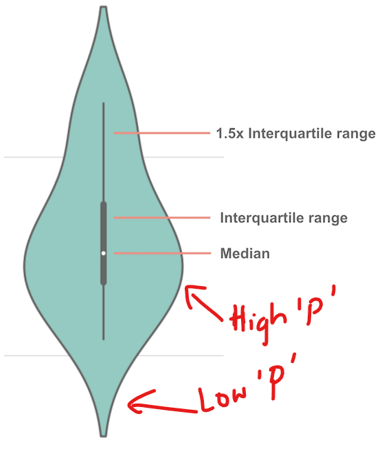
That is when a violin plot comes into the picture. It is a hybrid of the boxplot and kernel density plot that show peaks in the data. The distribution of numerical data can be visualized. While a box plot can only show summary statistics, violin plots can depict summary statistics and the density of each variable. The broader sections of the violin plot represent a higher probability that members of the population will take on the given value; the thinner sections represent a lower probability. (‘p’ in the image below)
So when information is the aspect that is important in choosing between a Boxplot vs Violin plot: A Violin plot wins.
Let us look at a violin plot for the same data as used above for the boxplot:
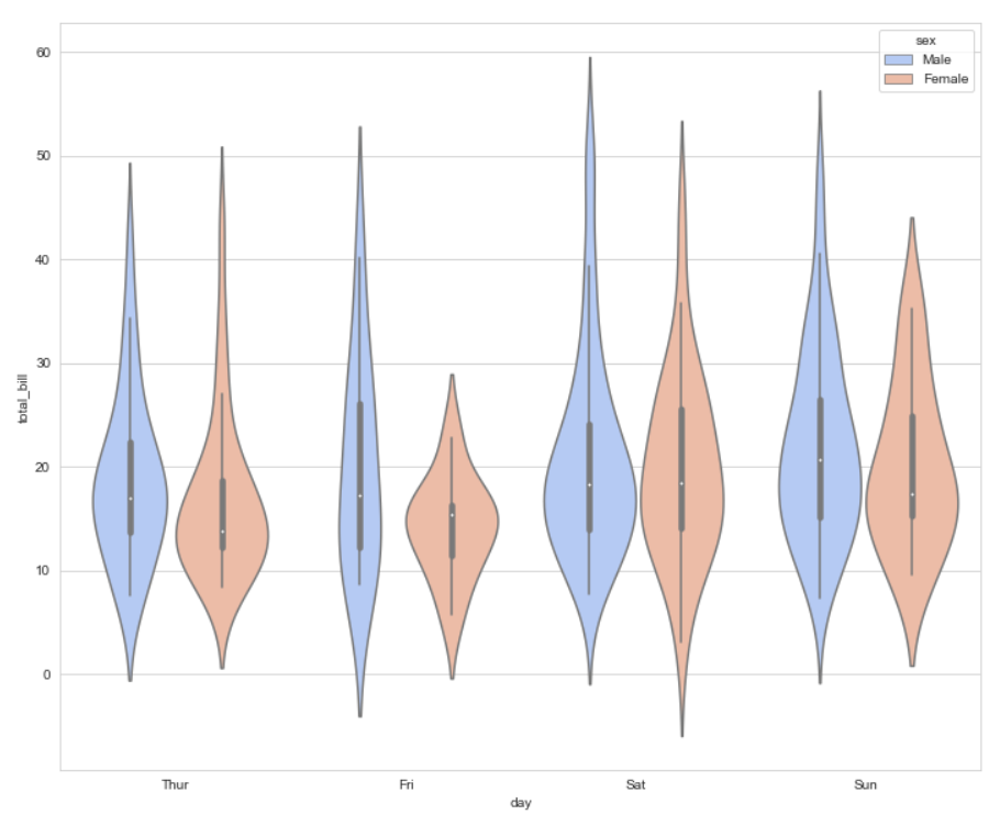
While the boxplots tell us that the median total bill value between 10 and 20 mostly, it does not tell us what is the probability of the total bill being in that range. The violin plot shows us the probability and tells us that the peaks are more defined in the case of female customers while flatter for male customers showing female customers generally spends very close to the median value. At least, if we consider which visual looks better between the boxplot vs violin plot for this data, it is a violin plot.
For more on Violin Plot, read -> Violin Plots
For the full code on how this violin plot was made, find it below:
import matplotlib.pyplot as plt
import seaborn as sns
%matplotlib inline

tips = sns.load_dataset('tips')

sns.violinplot(x='day',y='total_bill',data = tips,hue='sex',palette='coolwarm')
With just changing one word, you get so much more out of your visualization which shows us why Violin Plots are a better visualization in this case.
Find the code comparison for Boxplot vs Violin plot below:
sns.boxplot(x='day',y='total_bill',data = tips,hue='sex',palette='coolwarm')

OR

sns.violinplot(x='day',y='total_bill',data = tips,hue='sex',palette='coolwarm')
A comparative conclusion
Boxplot vs Violin Plot has been a question for a long time. Using boxplots can define your data to people in an easy way because there just is so much you can learn about your data using a boxplot.
Now when you see a boxplot and violin plot, the basic difference is only the underlying KDE plot in the violin plot which is not evident in the boxplot. The violin plot can help a viewer understand the probability of things and therefore it is imperative for you to use a violin plot if you have a large enough dataset to capture the underlying probabilities of your dataset.
Two things that can help you choose between the boxplot vs violin plot: The size of your dataset and your audience. If the size of your dataset is big enough, use a violin plot to show the additional information only ensuring you don’t put up too much information to show for your audience which might not understand the essence of densities in a visualization like a violin plot. However, if you choose to put the violin plot in your report, make sure you indicate what story it tells about your data.
Boxplot vs Violin plot also, therefore, is a choice that depends on the data analyst/scientist to decide what would be a better option for the analysis.
For more such content, check out our website -> Buggy Programmer

An eternal learner, I believe Data is the panacea to the world's problems. I enjoy Data Science and all things related to data. Let's unravel this mystery about what Data Science really is, together. With over 33 certifications, I enjoy writing about Data Science to make it simpler for everyone to understand. Happy reading and do connect with me on my LinkedIn to know more!
- Yash Gupta
- Yash Gupta
- Yash Gupta

