Heat maps are easy-to-make graphical visualizations that are generally used to represent intensities in the form of squares or rectangles with colors being used to show the intensity. Heat maps in Tableau can help you understand your data better and it is pretty easy to make, a heat map is mostly used in statistical modeling and you can find the most used heat maps in analyses to be a part of the Seaborn library in Python.
Also read, Tableau vs Power BI vs Alteryx
In this article, we’ll go over a simple explanation of what heat maps are and how you can interpret them, their simplest use case of a correlation matrix, and then how you can make heat maps in Tableau. Feel free to skip to any section as per your preference.
Heat maps in tableau and everywhere else: What are they?
Shading matrices are not new and so is a heat map. A heat map is a 2-D or 2-dimensional plot, that takes upon it the task to show the magnitude or intensity of a phenomenon differentiated by different shades or hues of color. The higher the intensity, the higher the magnitude.
The size of the cells in a heatmap is generally not representative of the magnitude but it can be used as a third variable depending on the sizes of the cells to helps cut down a lot of numbers to visualize patterns and numbers easily based on the magnitude of their occurrence as a part of a heat map. This data visualization technique finds its way into pretty much all numerical data’s exploratory data analysis. Heat maps in the tableau can be used for a medium-sized dataset though it’s preferable to use seaborn for the same.
Find more about heat maps here -> Heat map defined
How to Interpret Heat maps in Tableau?
Interpreting a heat map is pretty straightforward, as it completely depends on the colors it depicts. A heat map in tableau or any application with no colors is as good as a very large matrix which is impossible to interpret. The intensity of the colors can be scaled to two different colors going from red to green or blue showing a diverging contrast that can differentiate something like correlation which has a negative and positive value to it.
There can otherwise be a monotone heatmap with one color where the intensity of the color can show the magnitude easily. For example, in something like Sales, which may have only a positive value, the intensity can be used to see which departments outdo other departments in an easy way.
Example use case: Correlation matrix
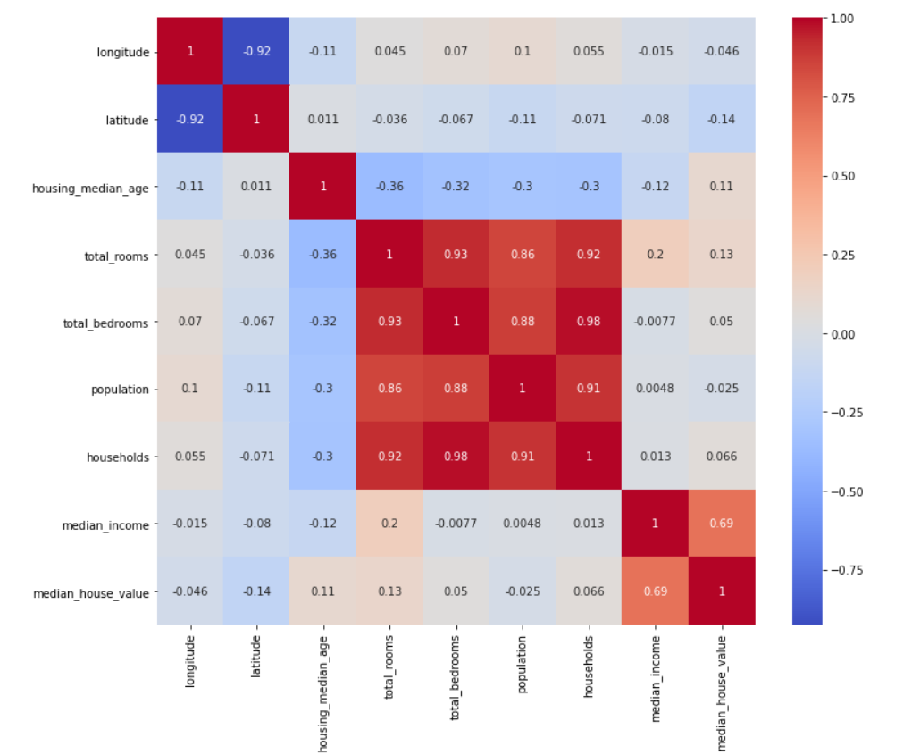
Heat maps find their most basic use case in a Correlation Matrix which can be done with heat maps in Tableau as well where the correlations of variables against other variables in a dataset are easier to understand and interpret while exploring the data using a heat map as compared to just seeing a matrix full of numbers. As you can see above, red depicts a positive correlation and blue depicts a negative correlation.
You can make such heat maps in tableau too provided you have a correlation matrix as the dataset.
How to make heat maps in Tableau?
Download Tableau Public from the following website -> Tableau Public
Find the covid data here *as seen in the example of heat maps in tableau above -> WHO COVID Data
Step 1:
Choose your numeric field and enter it for the size.
Step 2:
Choose a color to differentiate the numeric field. It can be the same as the previous one or a new field in case you want a hue to differentiate a second variable.
Step 3:
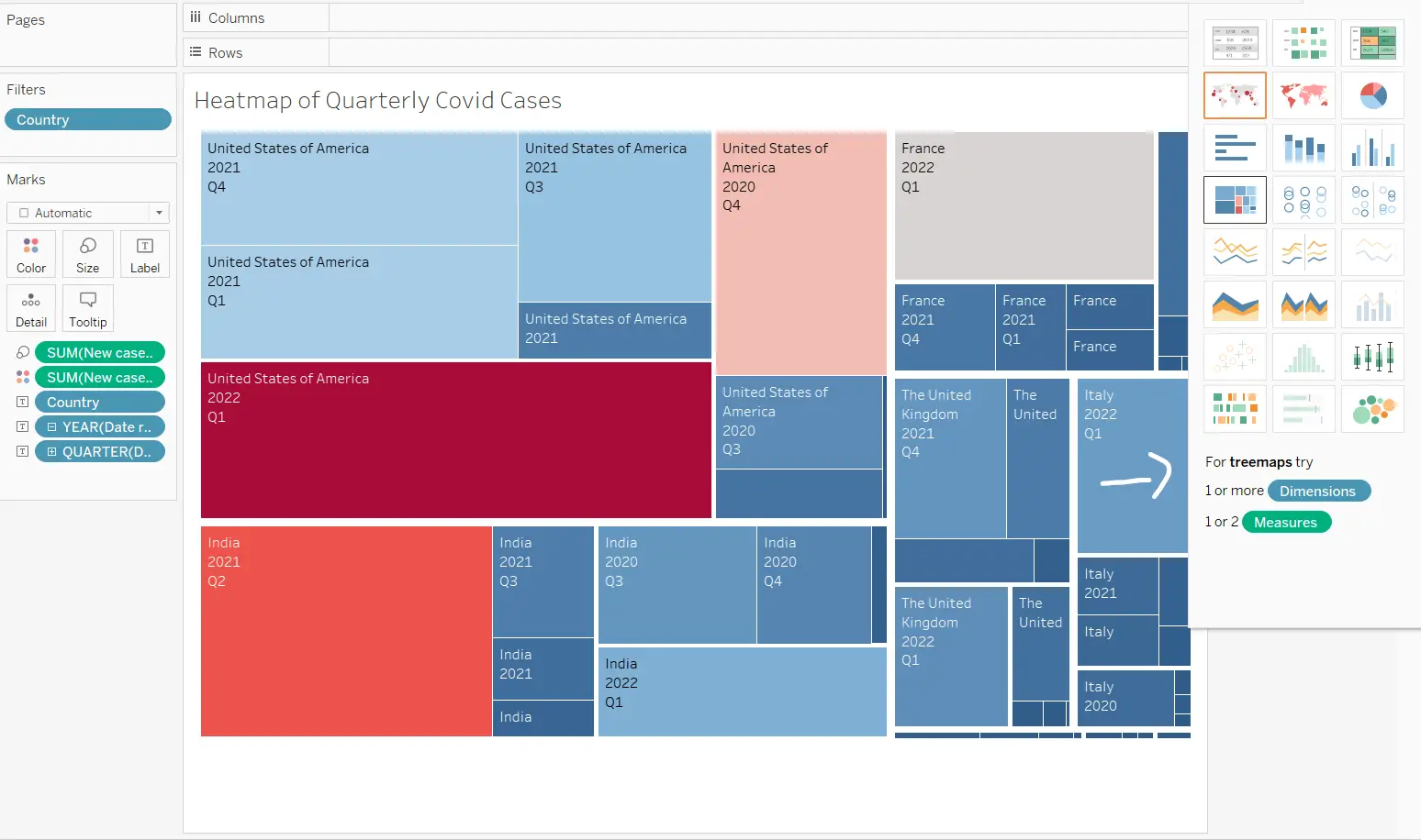
Change the visualization in consideration by using the Show Me button and choosing the fourth visual in the first column i.e., the treemap.
The treemap can be considered to be a modified heat map where the size of the box is related to the variable it denotes. In this case, the heat maps in Tableau are for the new cases of covid in each quarter of multiple countries of the world. As you can see it’s a two-way diverging red-blue palette where red depicts higher cases and blue depicts comparatively lower cases. The intensity of the color shows the magnitude.
And with just two to three steps you can make your own heat maps in Tableau leading you to analyze patterns in your data better. You can also do this for charts like Bar charts and other charts with one numeric value which you can take in Tableau and convert to a treemap or heat map as required.
The change takes barely a second and this is one of the primary reasons why heat maps in Tableau are easier to make than in programming. They are also interactive which can convey a lot of information to the viewer just by hovering over one of the boxes.
Conclusion
Heat maps in Tableau are easy to make with the drag and drop interface and one can make use of the aesthetic data visualizations without any technical expertise as well. The drag and drop functions can be learned within a day and Tableau can make any kind of visual for you as necessary. It is a benchmark application in today’s data viz industry.
Try checking out Tableau and making a heat map for your own datasets and let us know what you think about it in the comments below!
For more such content, check out our website -> Buggy Programmer

An eternal learner, I believe Data is the panacea to the world's problems. I enjoy Data Science and all things related to data. Let's unravel this mystery about what Data Science really is, together. With over 33 certifications, I enjoy writing about Data Science to make it simpler for everyone to understand. Happy reading and do connect with me on my LinkedIn to know more!
- Yash Gupta
- Yash Gupta

