If you indulge in analyzing datasets frequently, you must know how to understand a correlation matrix. Understanding correlations between variables using a Correlation Matrix is an important part of the EDA or the Exploratory Data Analysis which happens immediately after you have cleaned the dataset. In this article, we’ll go over quick pointers that will help you answer your questions on how to understand a Correlation Matrix and what it indicates easily.
Correlation Matrix
A correlation matrix in simple terms is a table that displays the correlation values (generally the Pearson’s Coefficient). Best used in datasets where there are variables that demonstrate a linear relationship between each other, a correlation matrix is easy to make and is one of the most efficient ways of understanding your data. The matrix depicts the correlation values ranging from -1 to 1 for all the possible pairs of values in a table.
For more on Correlation Matrix -> Correlation matrix
Understanding a Correlation Matrix with values
It is important to know what the values in the Correlation matrix mean if you want to know how to understand a correlation matrix.
NOTE: Correlation is not equal to Causation. There is a show of possible relationships using Correlation Matrix values but the values no matter how extreme, do not indicate causation.
The values in a general Pearson’s Correlation can be anywhere between -1 and 1 indicating the following:
- Strong Negative Correlation: A value very close to -1 in the correlation matrix depicts a negative correlation and the pair of variables in this scenario are highly or strongly inversely related i.e., as one value increases the other decreases and vice versa.
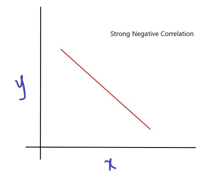
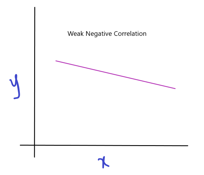
- Weak negative correlation: A value very close to 0 but negative i.e. -0.x in the correlation matrix depicts a negative correlation and the pair of variables in this scenario are slightly inversely related i.e., as one value increases the other decreases and vice versa but not by a large magnitude.
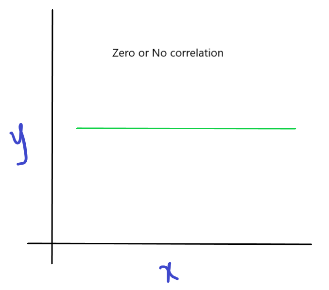
- No Correlation: A value of 0 in the correlation matrix depicts no correlation and the pair of variables in this scenario are not statistically related i.e., as one value increases or decreases the other variable does not change.
- Weak Positive Correlation: A value very close to 0 but positive i.e. +0.x in the correlation matrix depicts a positive correlation and the pair of variables in this scenario are proportionally related i.e., as one value increases the other increases and vice versa but not by a large magnitude.
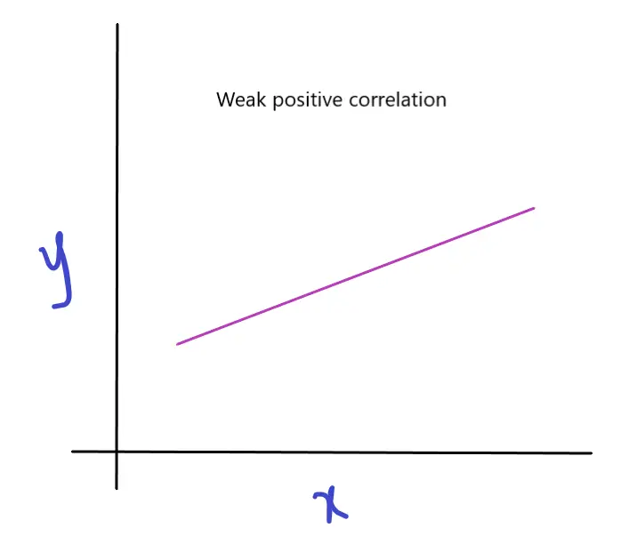
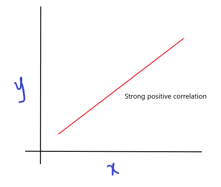
- Strong Positive Correlation: A value very close to 1 in the correlation matrix depicts a positive correlation and the pair of variables in this scenario are proportionally related i.e., as one value increases the other also increases and vice versa.
How to understand a Correlation Matrix using a Heatmap in Python (Seaborn)?
Making a beautiful heatmap of the correlation matrix like as above is easy. It helps you understand a correlation matrix better. You can create a correlation matrix heatmap (recommended) with the steps given below.
Step 1: Importing your libraries
import pandas as pd
import matplotlib.pyplot as plt
import seaborn as sns
%matplotlib inline
Step 2: Read your data
df = pd.read_csv("Housing Data.csv")Step 3: Make a correlation matrix of your data
df.corr()
Step 4: Use Seaborn to make a beautiful heatmap
sns.heatmap(df.corr(), annot = True, cmap = 'coolwarm')
You can choose to include the cmap = ‘coolwarm’ part of the code if you like the color palette and the annot = True indicates that we want to see the actual number in each square of the heatmap.
For more on Seaborn Heatmaps : Seaborn Documentation
As you can see, it’s very simple to make a correlation matrix and a heatmap in just four steps.
Now onto our main question.
How to understand a Correlation Matrix?
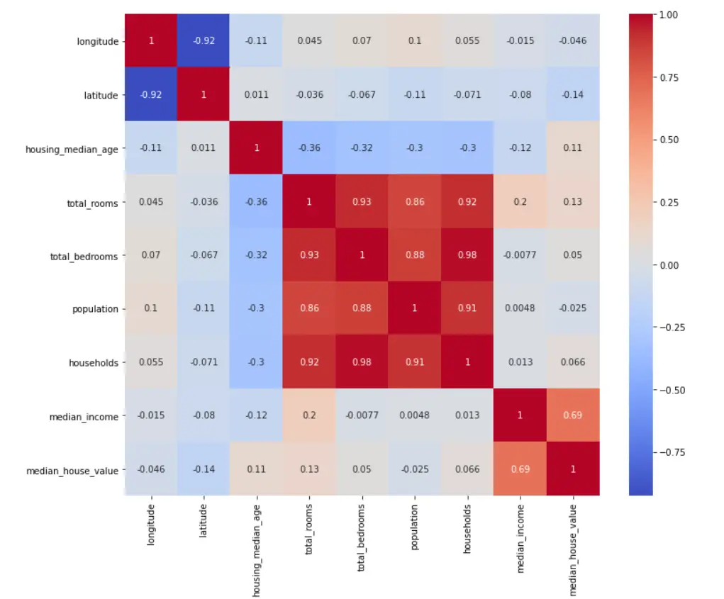
As you can observe in the heatmap, there are a lot of variables in the dataset and they own corresponding correlation values against the other variables. The correlation matrix is pretty easily understandable if you know what the correlation values mean. How to understand a correlation matrix comes down simply to the fact that what are you able to pick out as relevant information from it. The correlation matrix is symmetrical about the diagonal so the values you see in the diagonal are the variables’ correlation with themselves which is a perfect positive correlation. The other squares in red and blue indicate correlations.
- As can be understood, the variables like Total Bedrooms and Total Rooms are highly positively correlated for obvious reasons.
- Similarly, households and total rooms are also highly positively correlated.
- There’s very low and weak positive correlation between Total Rooms and Median incomes showing that there is hardly a relationship there.
- Latitude and Longitude are negatively correlated but of course for someone with domain knowledge, it is clear that there is no relationship in reality there.
As already mentioned, these are just ways through which one can understand a correlation matrix and get a feel for their data and a gist of where the relationships might lie in a simple way, it is NOT a show of causation.
For more on Correlation and Causation -> Difference between Correlation and Causation
Conclusion
A correlation matrix is one of the first things every data scientist uses in their EDA. Knowing how to understand a correlation matrix to indicate relationships, it gives a line of thought for the data scientist to follow. If a dataset is given to the data scientist to find relationships in, a correlation matrix is undoubtedly one of the best ways to go about it. It is generally more helpful in cases where a linear relationship is existent. If there are any parabolic or other relationships in the data, it is important that the domain knowledge is extended to the analyst so that they can make sure that they take it into consideration in their data.
For more such content, check out our website: Buggy Programmer

An eternal learner, I believe Data is the panacea to the world's problems. I enjoy Data Science and all things related to data. Let's unravel this mystery about what Data Science really is, together. With over 33 certifications, I enjoy writing about Data Science to make it simpler for everyone to understand. Happy reading and do connect with me on my LinkedIn to know more!
- Yash Gupta
- Yash Gupta
- Yash Gupta

