If you are working on a project relating to clustering, you should know how to make a cluster map in seaborn. Cluster maps are one of the most important graphical representations of a clustering algorithm. They are similar to a Dendrogram in terms of how they are used and can be used to understand how different variables are related or can be clustered with each other. The library is highly useful to make beautiful data visualizations and can do so in the quickest and most effective one-liner codes which can also take your analysis to the next level.
In this article, we’ll go over a simple definition of what a cluster map is and then go about understanding how to make a cluster map in Seaborn using just two to three lines of code.
For more about Seaborn, check out the official documentation of the python library here -> Seaborn Library
Let’s dive right into cluster maps now.
What is a Cluster Map?
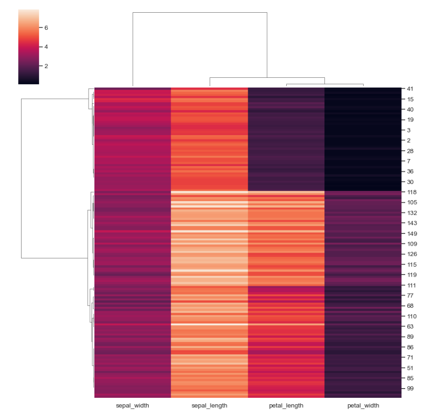
While a heatmap can show people more about their data in the form of a colored matrix that shows the magnitude based on the intensity of color, generally used for correlation matrices to identify patterns in data and see what things mean beyond the many numbers of a correlation matrix, a cluster map in seaborn takes it one step ahead.
The cluster map can show the correlations (example) in the same colored heatmap but collectively put together to represent which variables could be related to each other based on Hierarchical clustering. Other parameters can be used instead of correlations to make a cluster map. Therefore, knowing how to make a cluster map in seaborn is imperative.
How to make a Cluster Map in Seaborn?
Step 1: Get Seaborn
Seaborn is a data visualization library built on top of the predominant and original Matplotlib library which helps users make beautiful data visualizations while allowing the visuals to be highly customizable and easily reproducible. Seaborn comes with a lot of inbuilt visuals that a user can choose from and can handle vast datasets easily.
According to Waskom, M. L., (2021). seaborn: statistical data visualization. Journal of Open Source Software, 6(60), 3021, https://doi.org/10.21105/joss.03021, It provides a high-level interface to matplotlib and integrates closely with the pandas data structures. Functions in the seaborn library expose a declarative, dataset-oriented API that makes it easy to translate questions about data into graphics that can answer them. When given a dataset and a specification of the plot to make, seaborn automatically maps the data values to visual attributes such as color, size, or style, internally computes statistical transformations, and decorates the plot with informative axis labels and a legend. Onto our final question now, how to make a cluster map in seaborn.
Also read, Tableau vs Seaborn
Step 2: Load libraries and datasets, Making the ClusterMap
Technical knowledge can be skipped if you only want to know how to make a cluster map in Seaborn and not go beyond it. You can copy the code below to make a cluster map.
import seaborn as sns; sns.set_theme(color_codes=True)
iris = sns.load_dataset("iris")
species = iris.pop("species")
g = sns.clustermap(iris)
It’s as easy as just one line of code to make a cluster map in seaborn. As you can see in the example cluster map in seaborn, it comes with dendrograms on the sides that you can analyze to see how closely related the variables are and where you can draw the line to hierarchically form clusters in your dataset. You can also scale the data to be normalized in a standard scaler in a cluster map code.
You can change the colors in the heat map of the cluster map in seaborn using the cmap parameter and you can also change the metric to relate to Euclidean or Manhattan distance or in our example of a correlation matrix, to Pearson’s correlation.
It’s important to know which metrics can help you in your analysis the most as the wrong metric can negatively impact your entire report. It is here that domain knowledge also plays an important role for the data scientist to make the right choice.
With just 5 mins of learning, congratulations, you now know how to make meaningful heat maps i.e., how to make a cluster map in Seaborn. Try using them in your analysis today.
Conclusion
Cluster maps in Seaborn which are just modified Heat Maps offer researchers more information than a normal heatmap but can be a little tough to interpret if you are not statistically inclined. You must see how Cluster maps can fit in your work and if you think that they can help you in your analysis or if your analysis needs grouping, you should take a minute to make a visually clear and readable cluster map in seaborn to provide to the stakeholders as a part of your report. However, learning how to make a cluster map in Seaborn will help you along in any analysis you do.
If you think the report can make do without a Cluster Map, you should include only those visuals that can impact the stakeholders’ judgment of the report or analysis without giving them too many things to look at that may cloud their decisions.
For more such content, check out our website -> Buggy Programmer

An eternal learner, I believe Data is the panacea to the world's problems. I enjoy Data Science and all things related to data. Let's unravel this mystery about what Data Science really is, together. With over 33 certifications, I enjoy writing about Data Science to make it simpler for everyone to understand. Happy reading and do connect with me on my LinkedIn to know more!
- Yash Gupta
- Yash Gupta

